Flick Energy
More than control over power usage, we found that Kiwis were strongly drawn to the fact that Flick was sticking it to the big guys—they liked the idea of being a part of a movement.
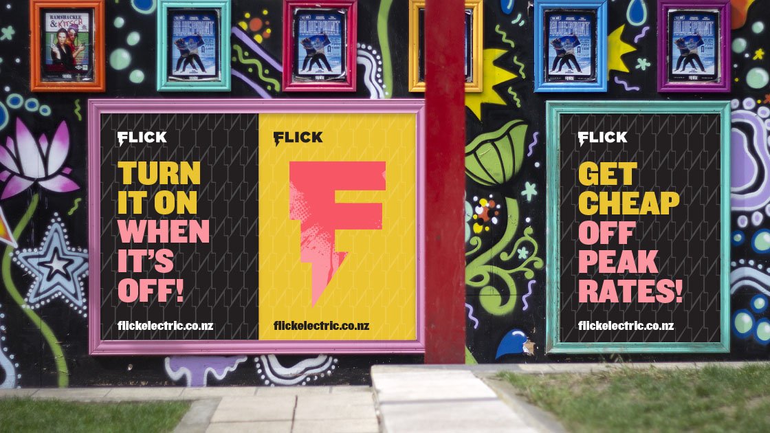
To characterise the brand, we settled on the archetype of the enlightened rebel. Flick is for the conscious consumer who demand more and go out and get it. Looking to other brands with activist attitudes across different categories, we also took our inspiration from protest imagery from last century.
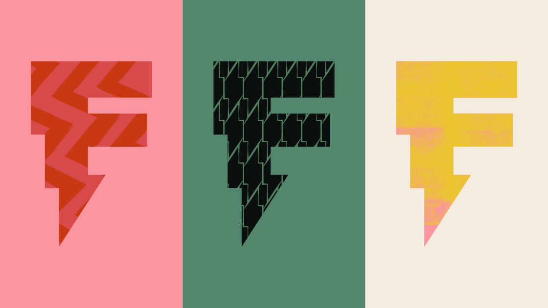
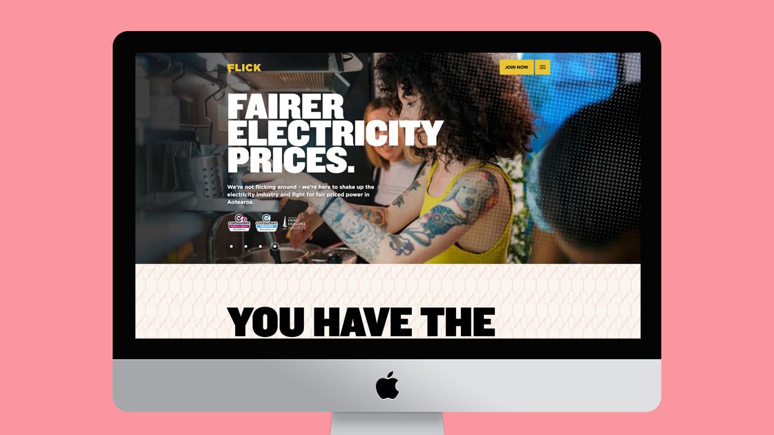
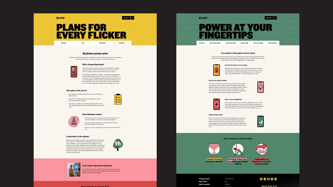
Combined with the Māori whakatuaiki—papa te uira ki runga, oho mai ki raro / lightning flashes above—and wakes up the people below. We envisioned Flick as a lightning bolt of consciousness to wake consumers up from power apathy. Together with a new logo, illustrations of Flick customers, graphic elements to represent energy sources, a te reo Māori glossary for communications and a new loud as thunder typeface, a cohesive, ownable brand emerged.
Flick do things differently and this extended to how they worked with us. Ocean and Flick worked as co-creators to share expertise to leverage and enrich the outcome. Co-creating the project enabled Flick to own the branding and roll it out in-house.
WORK COMPLETED AT OCEAN DESIGN